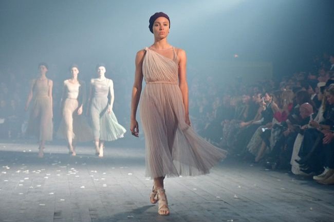
Colors can reflect our feelings, our personalities, and even speak to our soul. Each hue on the color wheel carries a myriad of unique emotions and creativity. But, how can you use colors as a fashion statement? The concept of color-coding your wardrobe is nothing new, but “Colors that Speak” will help you understand how to personalize your fashion to express yourself through hues. Unlock the power of color to express yourself and find your true fashion palette.
1. The Language of Colors: An Introduction to Color Psychology
Colors are powerful, they don’t just make things look good – they can also have an effect on people’s mood and behavior. Color psychology is the study of color’s effect on humans, ranging from physical and emotional reactions to even evoking powerful memories. By understanding how colors affect us, we can use them to our advantage and even boost our own productivity and goal achievement.
- The psychology of color: Color psychology can be broken down into two parts. First, it studies how humans psychologically respond to individual colors. Reaction to color varies between cultures, ages and genders, but some general trends are clear. For example, warm colors like red and yellow tend to evoke emotions like energy and excitement, while blue and green are associated with tranquility and calm.
- Color cues: The second area of color psychology relates to how it influences our decisions. For example, in retail stores certain colors are more likely to cause customers to purchase items. Red communicates urgency, making shoppers more likely to act quickly, while blue causes them to linger longer.
- Emotional triggers: Colors can also be used to evoke fond memories or spark deeper emotions. For example, red is often used to energize people and boost their confidence. Yellow is often associated with happiness and optimism, while blue can be calming and promote creativity.
- The power of color: Color psychology is important to consider when it comes to marketing, design, and even our daily interactions with others. A knowledge of color theory can help us make decisions that are both visually pleasing and emotionally effective.
2. Establishing a Relationship between Hues and Moods
It’s no secret that color can affect our emotions, but what about hues specifically? Studies show that certain hues can provoke powerful reactions in viewers, and depending on the environment, they can bring out varying emotions. With the right combination of hues, you can convey a wide range of moods in your artwork, or in any design piece.
Cool Hues
Cool hues, such as blues, greens, and purples, are often associated with calming emotions such as tranquility, serenity, and relaxation. Shades of blue evoke a feeling of trust and peace, and homes that contain blue décor are often used to create special relaxation spaces. Greens, on the other hand, are often associated with positivity and hope, and are often used to create a feeling of balance and harmony. The lighter ranges of purple, such as lavender, bring out feelings of kindness and spiritual connection.
Warm Hues
- Warm hues, such as reds, oranges, and yellows, bring out intense emotions like love, excitement, and joy.
- Reds often attract attention, and can be perceived as either passionate and romantic or aggressive and angry. Some studies even suggest that red can cause increased heart rate and temperature in viewers.
- Vivid oranges create a feeling of energy and enthusiasm, Yellow, and its variations, can bring out feelings of contentment and joy.
Neutral Hues
Neutral hues, such as white, black, and browns, are often used to establish a sense of security and balance. White often feels clean and inviting, blacks can often come across as mysterious or elegant, and browns convey feelings of coziness and comfort. These hues are often used to set the stage in interior design, as they can provide a unique background for a room, or create a special ambiance.
3. Tips on How to Incorporate Colors into Your Wardrobe
When it comes to selecting colors for your wardrobe, one thing is for certain: you’re always aiming for a balance of color and style. Your entire outfit will speak volumes about your fashion sense, so it’s worth taking the time to experiment with your color choices. Here are a few practical tips to get you started.
1. Pick the Perfect Palette
The key to creating an eye-catching look is to find a color palette that suits your aesthetic. Consider which colors flatter your complexion. When in doubt, go for classics such as black, white, and navy blue, as they are timeless and can be mixed with other colors. Additionally, select colors that complement each other. For example, navy and teal look great when paired together. Alternatively, you can bring together powerhouse colors like red and yellow.
2. Add Accents to Add Interest
If you want to take your wardrobe to the next level, add pops of color via accessories and other accents. Look for bold scarves, jewelry, purses, and footwear that all tie in with your desired color scheme. Splashes of color will draw attention to your outfit and can become conversation starters.
3. Don’t Be Afraid to Experiment
Though certain color combinations work better than others, don’t feel limited to the traditional rules. Be creative and adventure outside of comfort zone. Be bold — you never know what works until you try it. Feel free to experiment with different color combinations and find new and exciting fashion looks.
4. Mind the Seasons
Consider the season before choosing colors for your wardrobe. Usually summer calls for bright, vibrant colors that brighten up the hot days and give you the perfect summer glow. For autumn, think of colors like burnt orange, olive green, and brown that evoke a sense of warmth. Dark tones such as grey, blue, and black are best during winter while springtime suggests soft pastels, light tones.
5. Find Inspiration
The fashion sphere is constantly providing new trends and color palettes, so you can use them to your advantage. Fashion retailers, influencers, and magazines are great sources of inspiration. Take note of what looks and colors you like, and incorporate them into your own style. Your wardrobe is a reflection of your individuality, so it should represent your best self.
4. Popular Color Combinations and Their Meanings
Have you ever wondered why some color combinations are more popular than others? Well, it turns out that certain colors are often used together for a specific purpose. Understanding the hidden meanings behind prevalent color combinations can help you make more effective and impactful design decisions.
Black and White
The timeless combination of black and white is often used to induce a sense of sophistication and modernity. This color combo is versatile for many contexts, but works best when paired with a unique typography. Used together, black and white can give an austere yet elegant impression.
Red and White
Red and white is an incredibly popular combination, usually used to capture attention and evoke emotions. The bright saturation of red stimulates viewers and makes them feel alert and action-ready. In contrast, white offers a calming background to deny the viewer’s attention from being overwhelmed.
Blue and Yellow
This combination is perfect for creating a cheerful and vibrant atmosphere. The contrast between the warm color of yellow and the refreshing blue makes the combination aesthetically pleasing and energizing. It’s often used in digital products to call attention to a specific feature.
Green and Pink
The union of green and pink produces a warm and playful effect, making it ideal for apps and other digital products that are targeting young people. Green paired with pink evokes a modern and youthful feeling. As such, this combination is often used in websites and apps for teens and kids.
5. Unleash Your True Colors: Get Creative with Color Pairs!
Color combinations can do wonders for the design of any space. As the old adage “variety is the spice of life” has taught us, color and its many combinations is one of the easiest and most effective ways to create a diverse, visually pleasing and exciting atmosphere.
When it comes to developing a colorful look for your home, don’t be afraid to experiment and break the traditional rules. Rather than matching all of your hues with each other, get creative and unleash your true colors with some fresh color pairings. Here are a few tips to help you get started:
- Create Contrast: Contrasting colors can be incredibly striking. Think blue and yellow, maroon and teal, black and white, or soft green and strong orange. Consider where the colors will appear in the room and how much contrast you’d like to see.
- Choose One Stand-Out Color: If you’re trying to create the perfect balance with your colors, consider having one be the dominant tone and the other acting as its complementary. Teal and pink, purple and yellow, and light gray and navy blue are beautiful pairings to consider.
- Get Creative: Combinations are key! Interesting color mixes such as light pink and camo green, hot pink and brown, or dark green and magenta can create an exciting and daring look.
- Be Subtle: For smaller spaces or those seeking a more subtle look, consider soft color combinations. Try cool blues, soft pinks, and other cool hues. You can also mix in white for a more airy look.
Just remember, unleash your true colors by playing around with color pairings. Take a risk and create something truly special for your space. With these tips, you’ll be on your way to creating a bold and vibrant color palette.
Let the vibrancy of colors speak your fashion story! Find the perfect shade of hues to express yourself and bring out the powerful essence of your style – your fashion palette holds the key.


